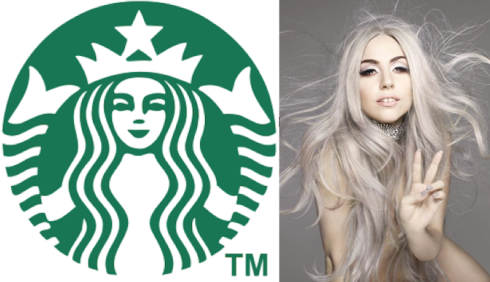
Today, Starbucks unveiled its fourth ever logo change to celebrate the brand’s 40th anniversary. Gone are the block letters that spell out “Starbucks”, and it sees the entire focus shift to the Siren. Here is Starbucks’ take on the redesign:
Our new evolution liberates the Siren from the outer ring, making her the true, welcoming face of Starbucks. For people all over the globe, she is a signal of the world’s finest coffee – and much more. She stands unbound, sharing our stories, inviting all of us in to explore, to find something new and to connect with each other. And as always, she is urging all of us forward to the next thing. After all, who can resist her?
In simple terms, she just looks a bit more like Lady Gaga did in the Vanity Fair shoot by Nick Knight. Or is that just me?


Haha! Great comparison!